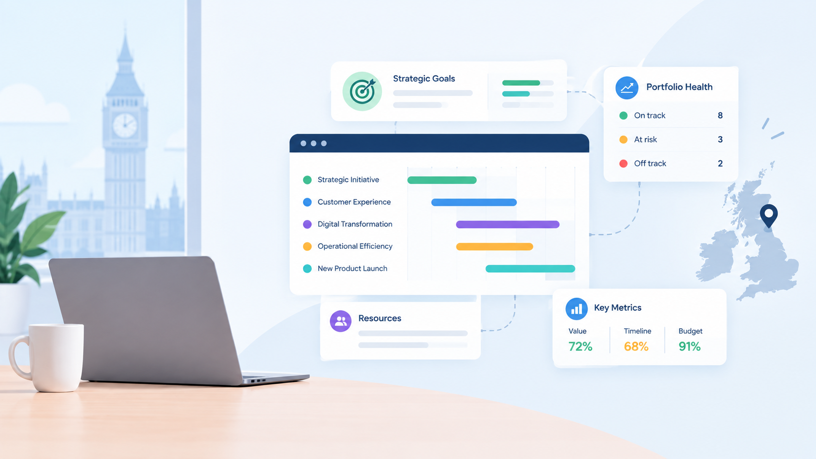

An executive portfolio dashboard shows whether an organisation's funded work, taken as a whole, is still delivering the strategy the board approved — not a project-by-project status list. Most dashboards fail executives by giving them delivery detail instead of that single strategic answer.
This guide covers what an executive dashboard should contain, what to deliberately leave off, and how the underlying data needs to work for the dashboard to stay trustworthy.
What executives actually need to see
A PMO Manager and an executive sponsor are answering different questions when they look at the same portfolio. The PMO needs enough detail to manage delivery day to day. The executive needs one thing: is this body of work still aligned to the strategy the board signed off, and where is that alignment at risk. See project portfolio management for how that oversight layer works more broadly.
The six components of an executive dashboard
1. Objective health. Each strategic objective shown with a clear status — not started, in progress, complete — and a target date that means something, tracked separately from project status. See why RAG status alone misleads executives.
2. KPI health, linked to objectives. Not a spreadsheet of numbers, but each KPI tied to the objective it measures, so a green project and a flat KPI don't get mistaken for success. See what belongs on a KPI dashboard.
3. RAG status aggregated across the portfolio. A single view of how many projects are on track, at risk, or off track, shown alongside — never instead of — objective health.
4. Budget vs. actual at the portfolio level. Spend-to-budget by project hides whether the money went to work still aligned to strategy. See why on-budget doesn't mean on-strategy.
5. Resource risk. Over-allocation across the portfolio, not per project, so burnout risk on key people is visible before it becomes attrition.
6. Projects at risk, surfaced proactively. A short list of what needs executive attention this month, not a full project register the executive has to scan themselves.
What to leave off
Task-level detail, individual assignments, and day-to-day status updates belong in the PMO's working view, not the executive dashboard. Including them buries the strategic answer under delivery noise and trains executives to stop looking at the dashboard at all.
How often it should update
An executive dashboard that's accurate as of last Friday isn't much better than a status email. The strongest dashboards pull from the same live data the PMO works from day to day, so the number an executive sees on login matches what the PMO sees, with no separate reconciliation step in between.
Project Director's executive dashboard is built around exactly this structure, live objective and KPI health, aggregated RAG status, budget versus actual, and resource risk in one view, so a board review can run straight from login rather than a briefing pack assembled the week before.
Frequently asked questions
What's the difference between a PMO dashboard and an executive dashboard?
A PMO dashboard shows delivery detail across every active project. An executive dashboard shows strategic alignment: objective health, KPI status, and where risk is concentrated, without project-level noise.
Should an executive dashboard show every project?
No. It should show aggregated status and a short list of projects genuinely at risk, not a full register the executive has to scan for themselves.
How often should an executive portfolio dashboard update?
Ideally live, pulling from the same data the PMO works from day to day, rather than a periodic snapshot that's already stale by the time it's reviewed.
See whether your portfolio still matches your strategy. Start your 14-day free trial.