
A KPI dashboard is a live view of an organisation's key performance indicators, showing current progress against target, status, and ownership in one place. In a project portfolio context, a KPI dashboard links each indicator back to the strategic objective it measures, so leadership can see whether delivery activity is actually moving the metrics that matter.
Most project tools give you a task dashboard: what's assigned, what's overdue, what's done. A KPI dashboard answers a different question entirely: is the work being done actually achieving anything measurable. For a PMO, that distinction is often the difference between reporting on activity and reporting on results. It's also central to project portfolio management as a broader discipline.
This guide covers what belongs on a KPI dashboard, real examples for project portfolios, and how to build one that connects to strategy rather than sitting beside it.
On this page
What is the difference between a KPI dashboard and a project dashboard?
A project dashboard tracks execution: tasks completed, milestones hit, budget spent, RAG status. A KPI dashboard tracks outcomes: whether the metric a strategic objective depends on is actually improving.
The two are related but not interchangeable. A project can be delivered perfectly, on time and on budget, while the KPI it was meant to move stays flat. That gap is exactly what a KPI dashboard is built to surface, and it is why the strongest portfolio reporting shows both side by side rather than treating project status as a proxy for strategic progress.
What fields belong on a KPI dashboard?
A well-built KPI, whether tracked in a spreadsheet or dedicated software, needs seven pieces of information to be genuinely useful:
- Name and description, stating clearly what is being measured and why it matters.
- Category, such as Customer, Financial, or Operational, so KPIs can be grouped and compared meaningfully.
- Current progress versus target, ideally shown as a percentage so status is immediately readable.
- Status, typically On Track, At Risk, Off Track, or Not Started, giving a fast visual read alongside the detailed progress figure.
- Owner, a named individual accountable for the metric, not a team or department.
- Measurement frequency, whether the KPI is reviewed monthly, quarterly, or on another cadence.
- Linked portfolio, connecting the KPI back to the strategic objective and the delivery work funded to support it.
Miss the last field and a KPI dashboard becomes a list of numbers with no connection to the projects actually meant to move them. That link is what turns a KPI dashboard from a reporting exercise into a genuine strategy tool.
KPI dashboard examples for project portfolios
Here is how KPI dashboards typically look across three common portfolio types.
Customer Digital portfolio. A portfolio focused on customer-facing digital transformation might track KPIs such as digital adoption rate, customer satisfaction score, and average resolution time, each linked to the specific programmes and projects (a mobile app modernisation initiative, a new customer data platform) funded to move them.
On-time Delivery portfolio. A portfolio built around improving delivery timelines and reliability would track KPIs such as on-time delivery rate, supply chain lead time, and delivery cost variance, linked to the supply chain optimisation programme responsible for improving them.
Financial Restructure portfolio. A portfolio focused on financial process optimisation might track KPIs such as processing cost per transaction, days sales outstanding, or system consolidation percentage, linked to a payment systems upgrade programme.
In each case, the KPI dashboard is doing the same job: showing whether the projects funded under that portfolio are actually moving the metric they were meant to move, not just whether the projects themselves are on track.
How to build a KPI dashboard that connects to strategy
Start from the objective, not the metric. Pick the strategic objective first, then define the KPI that proves whether it is being achieved. Building the dashboard the other way round, starting from whatever data is easiest to pull, produces a dashboard full of numbers nobody can connect to a decision.
Limit each portfolio to a handful of KPIs. A dashboard with thirty tracked metrics is not more rigorous than one with five, it is just harder to read. Choose the KPIs that would genuinely change a funding decision if they went off track.
Assign a named owner to every KPI. A metric with no owner tends to drift unnoticed until a board review forces the question. An owned metric gets flagged the week it slips.
Set the status thresholds before you need them. Define what counts as On Track, At Risk, and Off Track in advance, using specific numbers where possible, so status reporting does not become a subjective judgement call made under pressure.
Review the KPI dashboard at the same cadence as the portfolio review. A KPI dashboard that only gets checked once a year cannot catch drift early enough to act on it.
Where a KPI dashboard fits in portfolio reporting
The strongest portfolio-level reporting puts a KPI dashboard next to, not instead of, project and RAG status. Seeing that every project in a portfolio is green tells you execution is healthy. Seeing the linked KPIs alongside that status tells you whether healthy execution is actually producing the outcome the portfolio was funded to deliver.
This is the gap most task management tools leave open. They can show you a project list and, at best, a basic progress bar. They were not built to hold KPI data as a structured, ownable object linked to a portfolio, which is why KPI tracking so often ends up living in a separate spreadsheet, disconnected from the delivery work it is meant to measure.
How software supports KPI dashboards
A platform built to support portfolio-level KPI dashboards should offer:
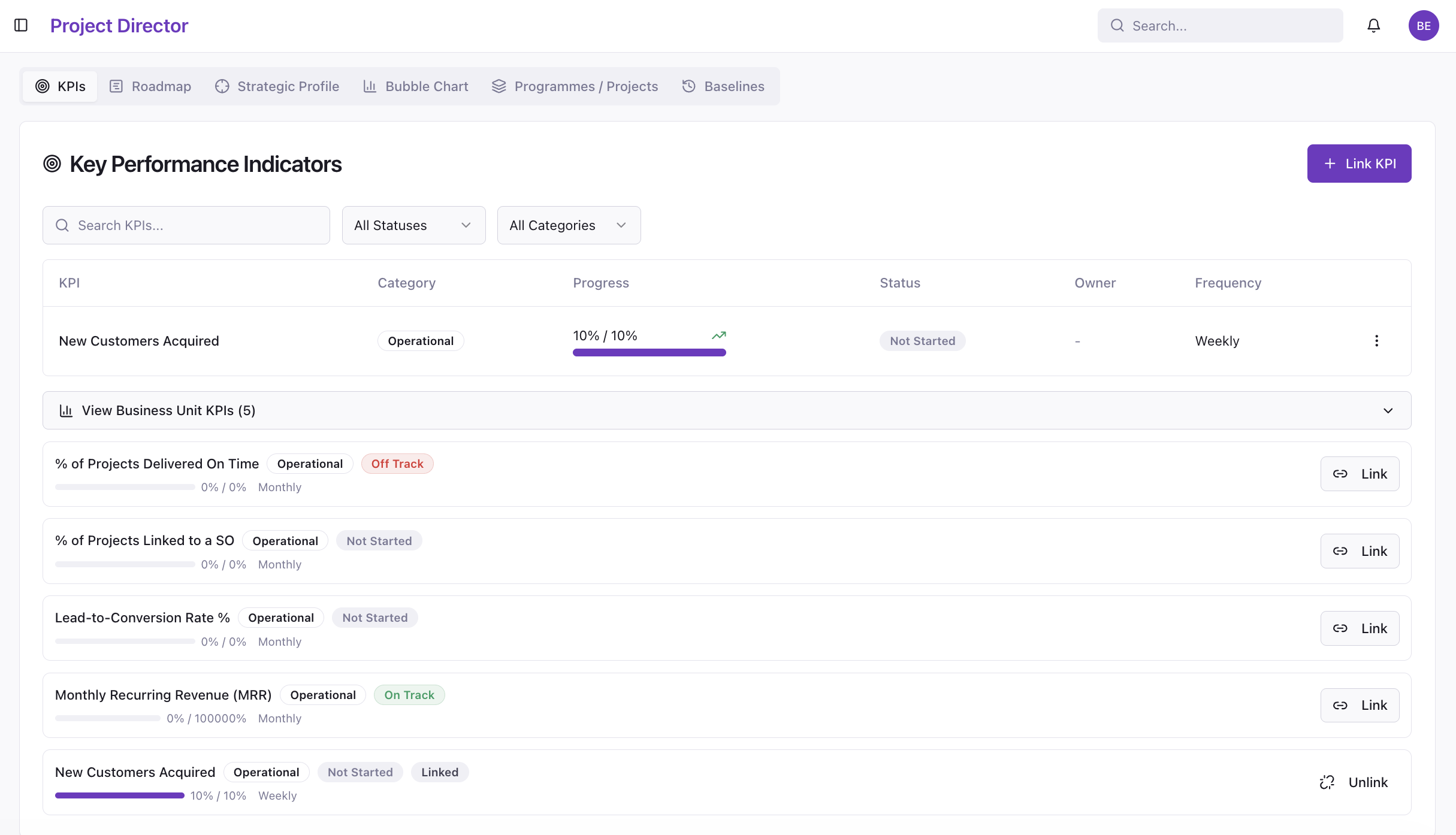
KPIs as structured objects, with name, category, progress, status, owner, and frequency captured natively, not bolted onto a project as a free-text field.
Direct linkage to portfolios and objectives, so a KPI dashboard is never disconnected from the delivery work responsible for moving it.
Portfolio-level KPI health aggregation, showing On Track, At Risk, Off Track, and Not Started counts across an entire portfolio in one view, rather than requiring a manual roll-up before every board meeting.
Project Director treats KPIs as first-class objects for exactly this reason. Each KPI captures name, description, category, progress against target, status, owner, measurement frequency, and its linked portfolio, and the Home dashboard aggregates KPI health across the whole organisation, so a PMO Manager can answer "are we moving the numbers that matter" without rebuilding the dashboard by hand.
The practical takeaway
A KPI dashboard is only as useful as its connection to the work meant to move it. Track KPIs in isolation from your portfolio and you get a set of numbers nobody can act on. Link them directly to the objectives, programmes, and projects funded to deliver them, and the dashboard becomes the clearest evidence a PMO has that its portfolio is doing what it was funded to do.
See whether your KPIs still match your strategy. Take the 14-day evaluation.