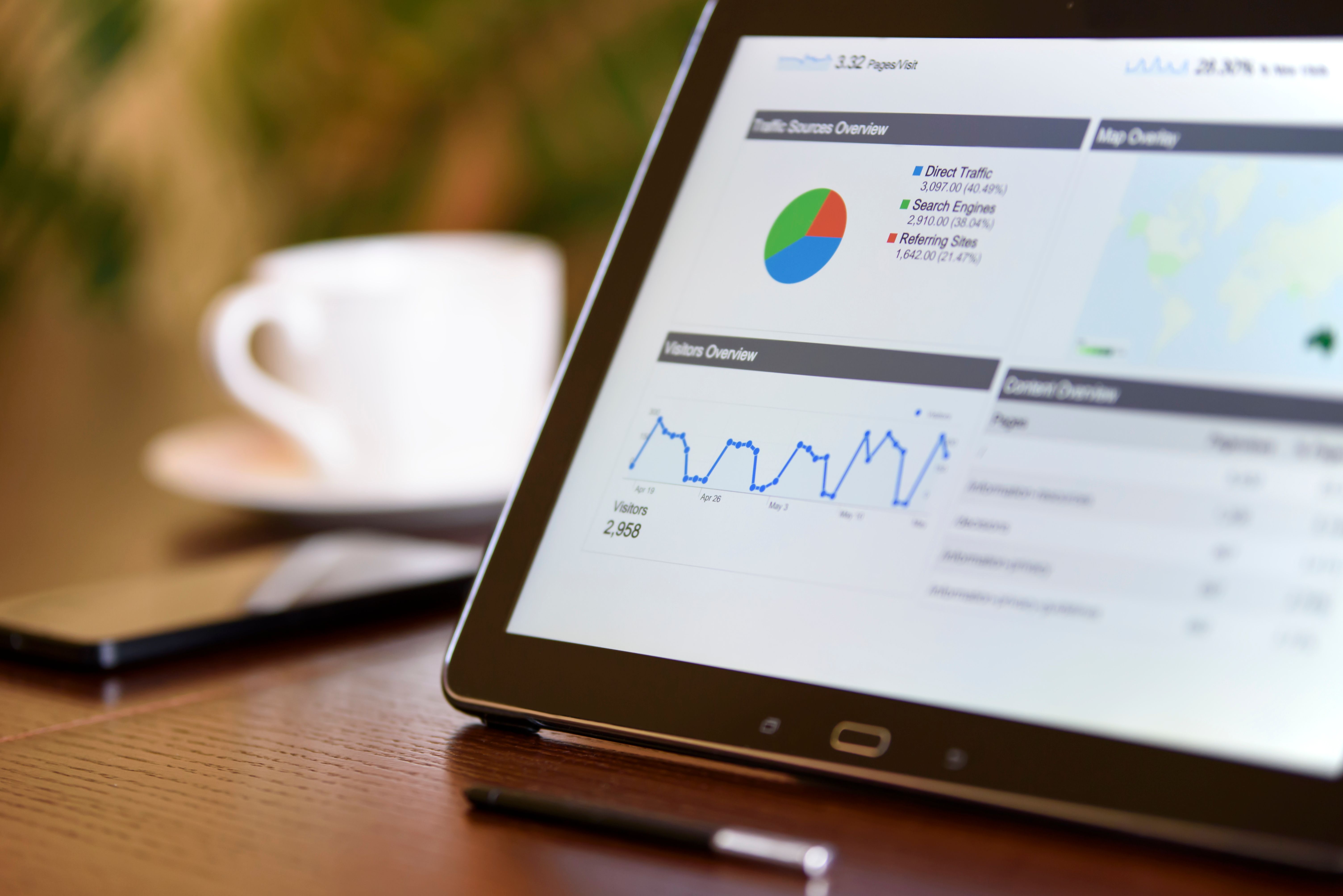

A PMO KPI dashboard tracks the performance of the PMO function itself, not just the individual portfolios it oversees. Where a portfolio KPI dashboard shows whether a specific strategic objective is being achieved, a PMO KPI dashboard shows whether the PMO's own governance, delivery, and prioritisation processes are working, across every portfolio the function manages.
The distinction matters more than it sounds. A PMO can report healthy KPIs for every individual portfolio and still have no way to answer whether the function as a whole is delivering value, whether its governance is being followed, or whether resource is being allocated well across the organisation. This guide covers the specific metrics that belong on a PMO KPI dashboard, grouped by category, and a practical process for building one.
Why a PMO needs its own KPI dashboard
Most KPI tracking in a PMO happens at the wrong level to answer questions about the PMO itself. Objective and KPI dashboards, built per portfolio, tell you whether a specific strategic outcome is on track. They do not tell you whether the PMO's ideas pipeline is filtering out weak initiatives before they consume budget, whether resource is being spread too thin across too many active projects, or whether governance standards are actually being followed rather than just documented.
A PMO KPI dashboard answers a different question entirely: is the function doing its job well, across everything it touches, not just within any single portfolio.
The five categories of PMO KPIs
1. Delivery performance
These metrics show whether projects across the whole portfolio are being executed well, aggregated rather than viewed project by project.
- On-time delivery rate. The percentage of projects completed within their original planned end date.
- On-budget delivery rate. The percentage of projects completed within their approved budget, or within an agreed variance threshold.
- Average schedule variance. The average percentage by which projects run over or under their planned timeline, across the active portfolio.
2. Strategic alignment
These metrics are the ones most PMO dashboards skip entirely, and the ones that connect delivery performance back to the reason the work was funded.
- Percentage of projects linked to an active strategic objective. Any project with no linked objective is a candidate for review, regardless of how well it is being delivered.
- Objective health distribution. The proportion of strategic objectives currently on track, at risk, and off track across the organisation.
- Portfolio drift rate. The percentage of active projects whose linked objective has changed status, or been closed, since the project was approved, a signal of work continuing after its original justification has moved.
3. Financial health
- Budget utilisation. Actual spend as a percentage of allocated budget, tracked at portfolio level, not just per project.
- Cost variance. The difference between planned and actual spend, aggregated across the portfolio, to catch overrun trends before they show up in a single dramatic project.
- Portfolio ROI or value delivered, where measurable, tying spend back to the strategic outcome it was intended to produce.
4. Resource and capacity
- Utilisation rate. The percentage of team members operating at healthy capacity (typically 80 to 100%), distinguishing this group from those under-utilised or over-allocated.
- Over-allocation rate. The percentage of team members allocated above 100% capacity across all the projects they touch, a leading indicator of burnout and slipping deadlines.
- Resource concentration. Whether capacity is spread across strategically aligned work, or concentrated on projects with weak or no strategic linkage.
5. Governance and pipeline
- Idea-to-approval conversion rate. The percentage of submitted ideas that pass the evaluation gate and become funded projects, a signal of whether prioritisation is genuinely selective or effectively rubber-stamping everything submitted.
- Average idea evaluation time. How long a candidate idea sits in review before a decision is made, since a slow gate process encourages people to route around it.
- Governance compliance rate. The percentage of active projects following required PMO standards, such as up-to-date RAG status, budget reporting, and risk logs.
How to build a PMO KPI dashboard, step by step
1. Separate PMO-level metrics from portfolio-level KPIs. Portfolio KPIs measure a specific strategic outcome. PMO-level metrics measure the function's own process health across every portfolio. Keep them as distinct sections, or distinct dashboards, so one does not get lost inside the other.
2. Choose a small number of metrics per category. Five categories with two or three metrics each is a genuinely useful dashboard. Five categories with ten metrics each is a report nobody reads past the first page. Pick the metrics that would actually change a decision if they moved.
3. Set a baseline before setting a target. Before deciding that on-time delivery should hit 90%, measure what it currently is. A target with no baseline is a guess dressed up as a goal.
4. Assign an owner to each metric. Delivery performance might sit with the PMO Manager, resource metrics with a Portfolio Manager, governance compliance with whoever runs the gate process. An unowned metric drifts unnoticed.
5. Review the dashboard on a fixed cadence, separate from portfolio reviews. A PMO's own performance deserves its own review rhythm, typically monthly, distinct from the portfolio-level and board-level reporting cycles covered elsewhere.
6. Revisit the metric set annually. A metric that was useful when the PMO was small, such as basic on-time delivery, may need to be replaced or supplemented as the function matures and governance and strategic alignment become the bigger risk areas.
Common mistakes in PMO KPI dashboards
Measuring activity instead of function health. Number of projects delivered, meetings held, or reports produced describe how busy the PMO is. None of them describe whether the PMO's decisions are actually good ones.
No strategic alignment metric at all. A PMO dashboard that only tracks delivery and budget can look entirely healthy while quietly funding projects with no connection to current strategy. The alignment category exists specifically to catch what the other four cannot.
Treating the PMO dashboard as a portfolio roll-up. A PMO KPI dashboard is not simply every portfolio's KPI dashboard stacked together. It measures the function's own process metrics, which need to be captured separately, not inferred from portfolio-level data alone.
How software supports a PMO KPI dashboard
Building this dashboard by hand means pulling data from project trackers, a resourcing spreadsheet, a separate ideas log, and a strategy document, then reconciling all four before every monthly review. A platform built to support this natively should offer:
Objectives and KPIs as structured, linked data, so strategic alignment metrics like portfolio drift rate can be calculated automatically rather than reconstructed by hand.
Portfolio-wide resource capacity data, showing utilisation and over-allocation across every active project a team member touches, feeding directly into the resource category.
A governed ideas pipeline with tracked status, so idea-to-approval conversion and evaluation time can be measured rather than estimated.
Aggregated delivery and financial data, rolling project-level RAG status and budget up into portfolio and organisation-wide views automatically.
Project Director captures each of these as native data: Objectives and KPIs sit at the top of the platform, Resource Capacity tracks utilisation across every active project, and the Ideas and Opportunities pipeline scores and tracks candidate work through its gate process, giving a PMO Manager the underlying data for a PMO-level dashboard without maintaining a separate spreadsheet alongside the delivery tool.
Frequently asked questions
What is the difference between a PMO KPI dashboard and a portfolio KPI dashboard? A portfolio KPI dashboard measures whether a specific strategic objective is being achieved by the projects and programmes funded under it. A PMO KPI dashboard measures the health of the PMO function itself, across every portfolio it manages, covering delivery performance, strategic alignment, resource use, and governance.
How many KPIs should be on a PMO dashboard? Most effective PMO dashboards track ten to fifteen metrics total, spread across the five categories, rather than an exhaustive list. More metrics rarely means more insight, it usually means a dashboard nobody reads in full.
What is the single most overlooked PMO metric? Strategic alignment metrics, such as the percentage of active projects still linked to a current objective, are the most commonly missing category. Most PMO dashboards track delivery, budget, and resource well, and skip the metric that would show whether the work is still the right work.
How often should a PMO review its own KPI dashboard? Monthly is typical, separate from the portfolio and board-level reporting cycles, since the PMO's own process health deserves its own review rhythm rather than being folded into a report built for a different audience.
The practical takeaway
A PMO that only measures the portfolios it oversees is missing half the picture. The other half is whether the function itself, its governance, its gate process, its resourcing decisions, is actually working. Build a dashboard that tracks both, and a PMO stops having to guess at its own effectiveness the same way it stopped having to guess at project status.
See whether your portfolio still matches your strategy. Start your 14-day free trial, no credit card required.